PARTAKE Package Redesign: Safe, Sweet, and Seen
Case Study
For this school project, we took on the challenge of redesigning the packaging for Partake, a Black-owned, allergy-friendly cookie brand founded by a mother determined to create safe, delicious treats for her daughter with food allergies. Partake’s vegan, gluten-free cookies are free from nine of the most common allergens and promise “Cookies Everyone Can Enjoy.” A visual audit revealed that while the product offers incredible peace of mind for families like our persona Pamela, its current packaging often receded on crowded shelves and had an overall generic aesthetic in comparison to other brands. This project explores how a dynamic, refreshed design could help Partake better capture attention in-store, highlight its allergy-free promise, and stand out in a competitive market.
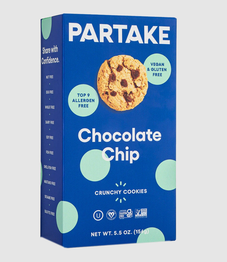
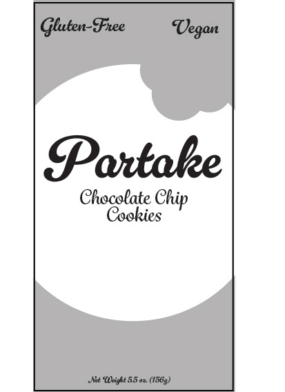
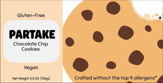
The original design was visually appealing and had a clean, polished look; however, a visual audit revealed that the product risked blending in on the shelf and conveyed a somewhat generic impression.
Research and Moodboard
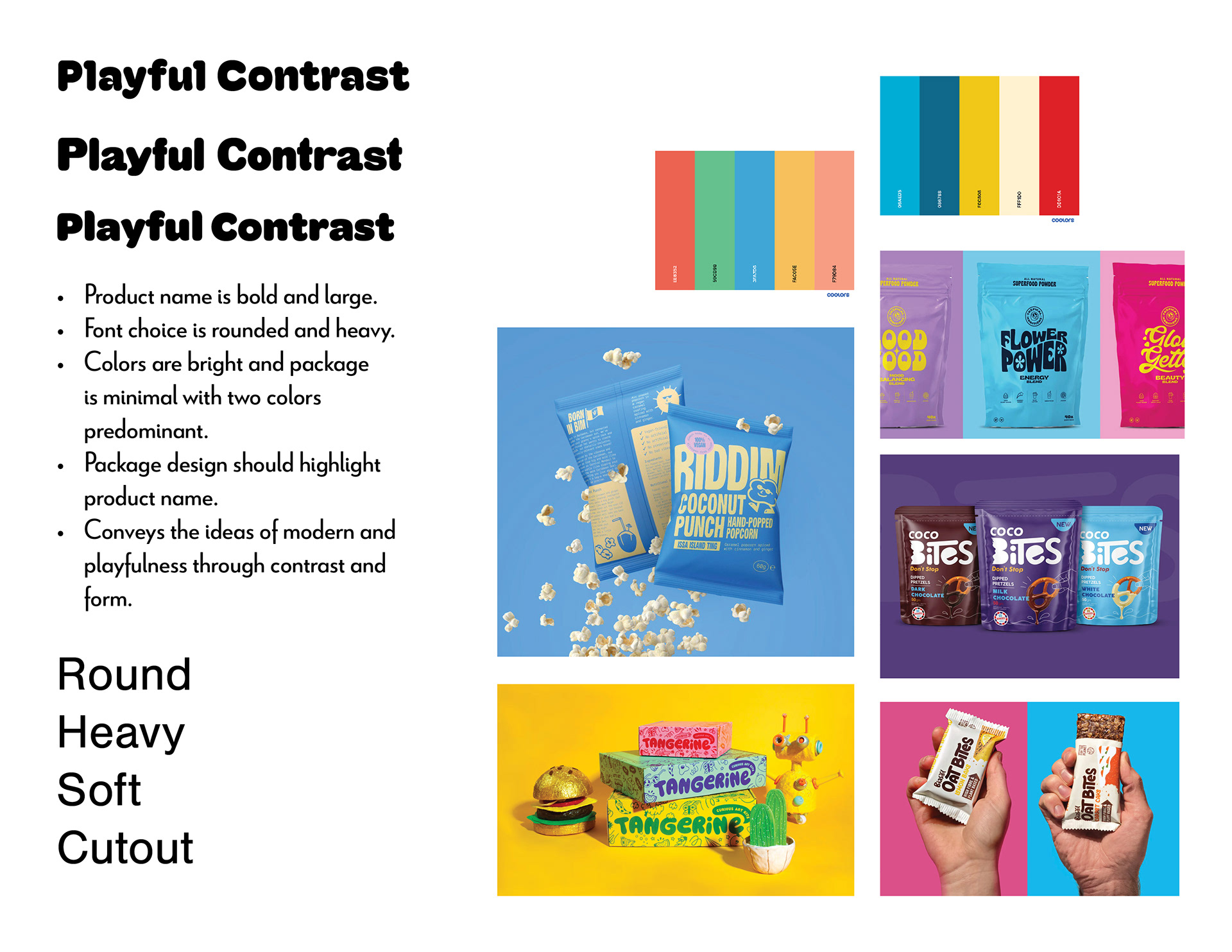
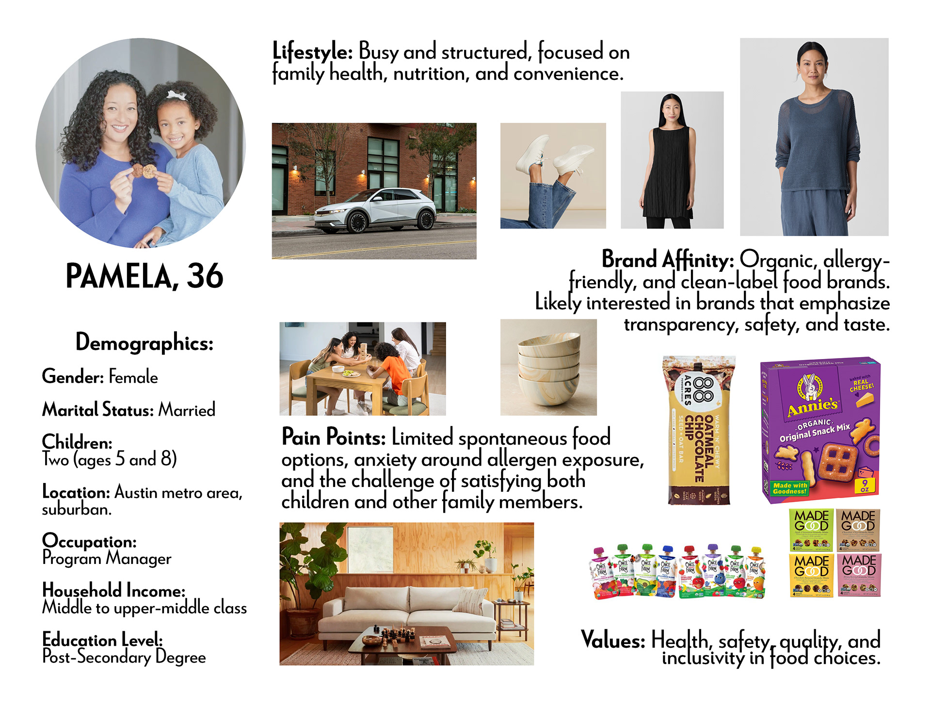
For this project, we developed a persona to guide the creative direction and assembled a mood board aimed at capturing a sense of playful contrast. Key themes included round, heavy, soft, and cutout elements, which helped shape the visual language and tone of the design.
Sketches
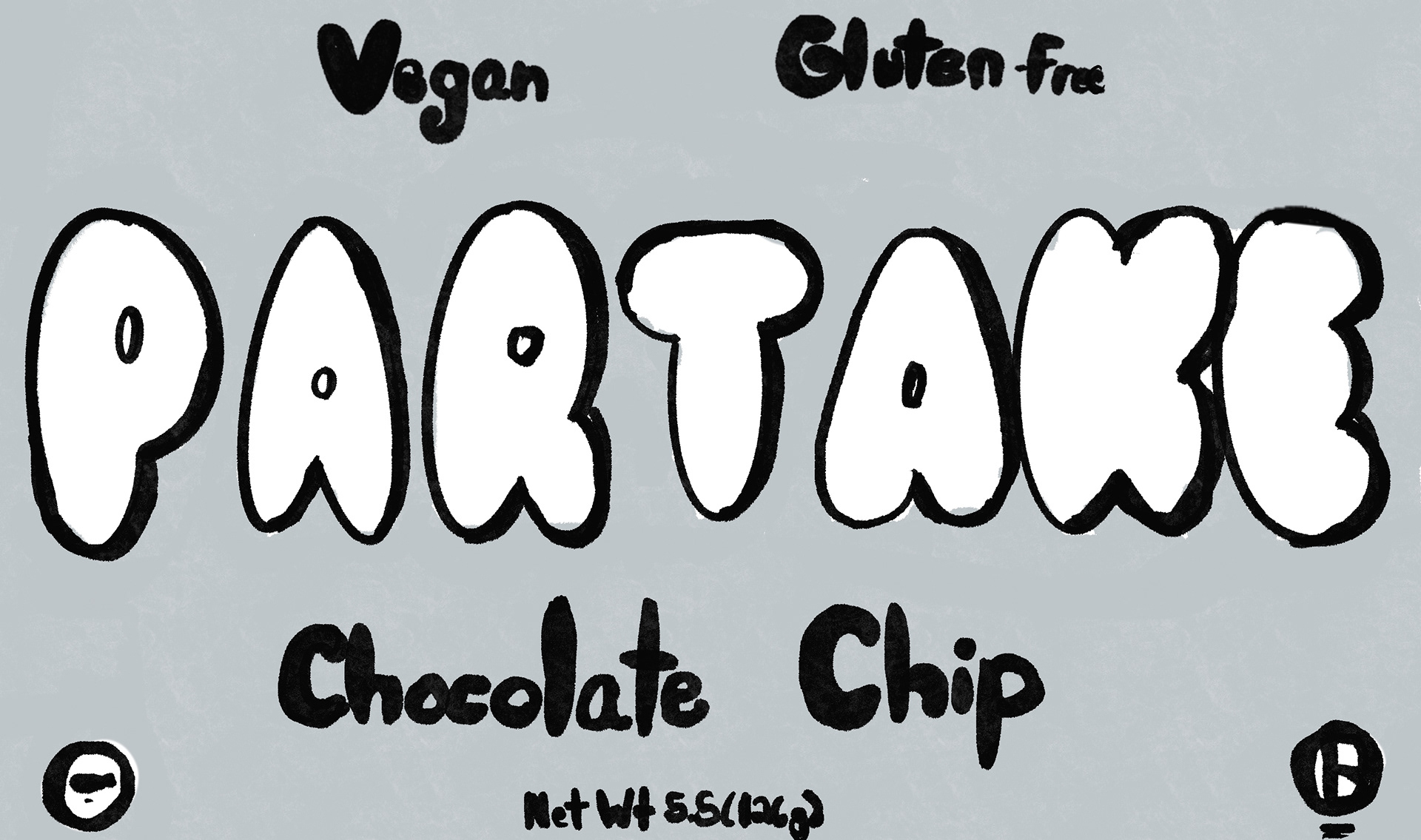
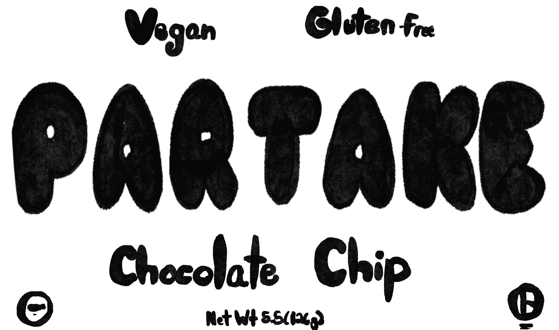
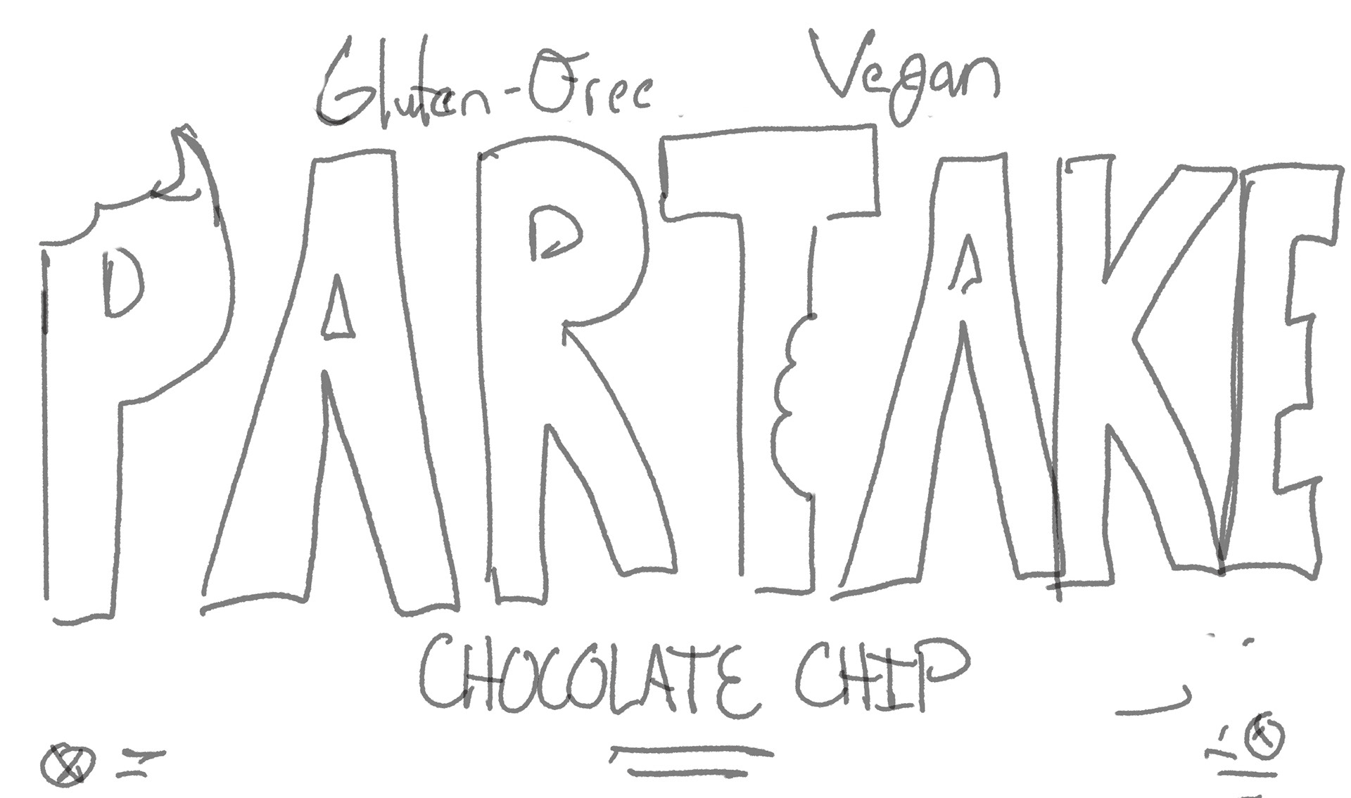
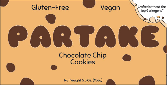
The sketches explored a variety of layouts and typographic treatments, focusing on how to balance playful contrast with clarity. These early concepts experimented with the key themes of round, heavy, soft, and cutout forms, setting the foundation for the visual identity.
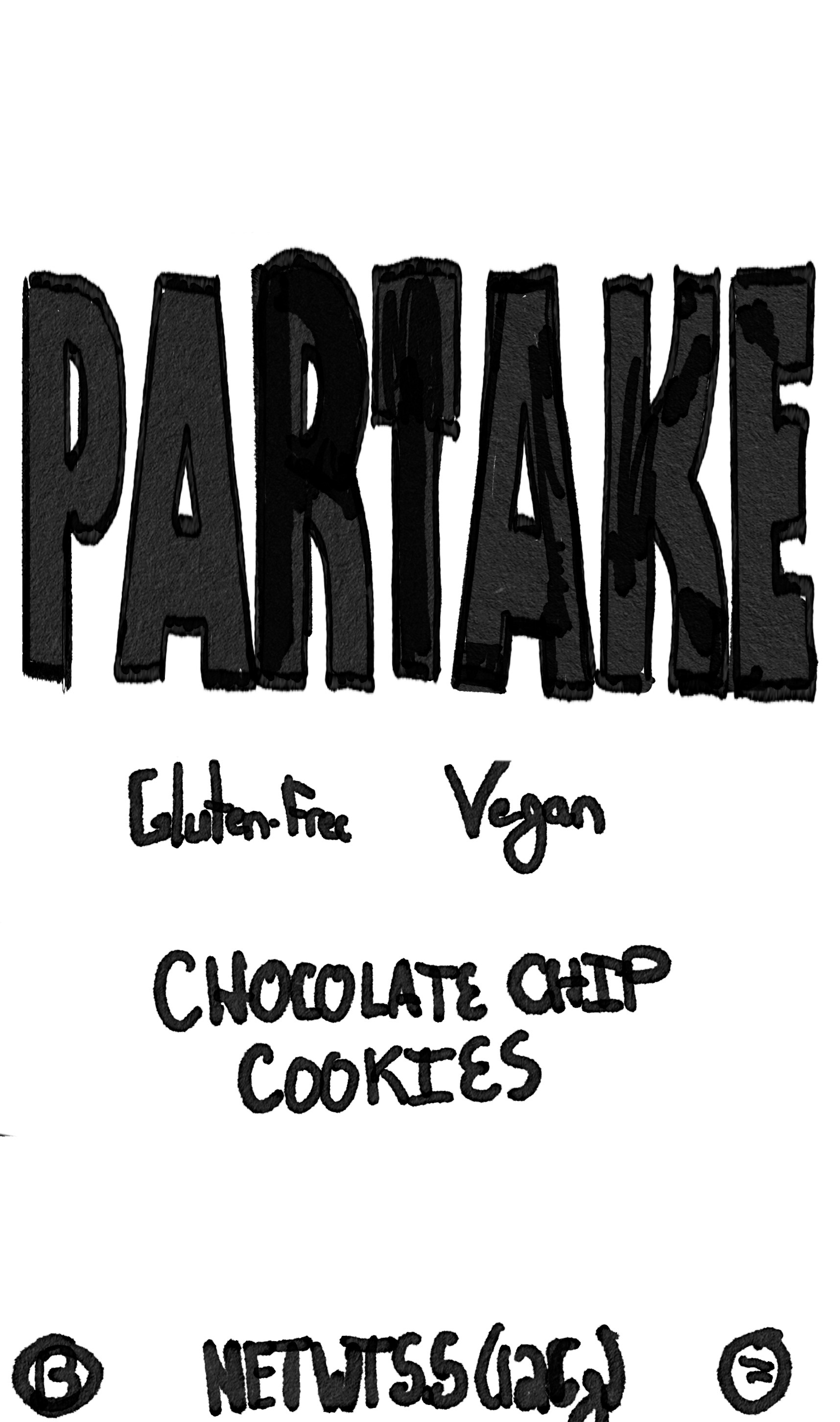
Drafts
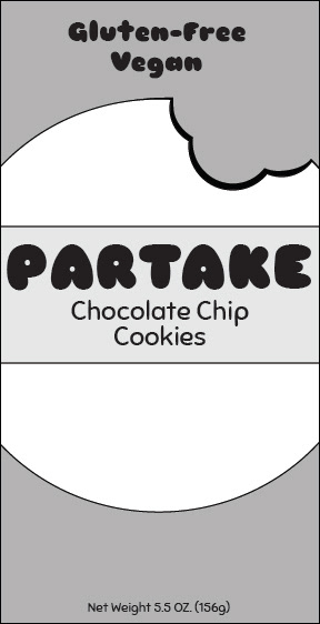
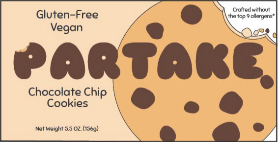
Moving into the digital phase, the drafts refined ideas from the initial sketches, experimenting with color, scale, and composition to amplify the sense of playful contrast. The digital explorations continued to emphasize the core themes allowing for a more precise evaluation of how these elements interacted on screen.
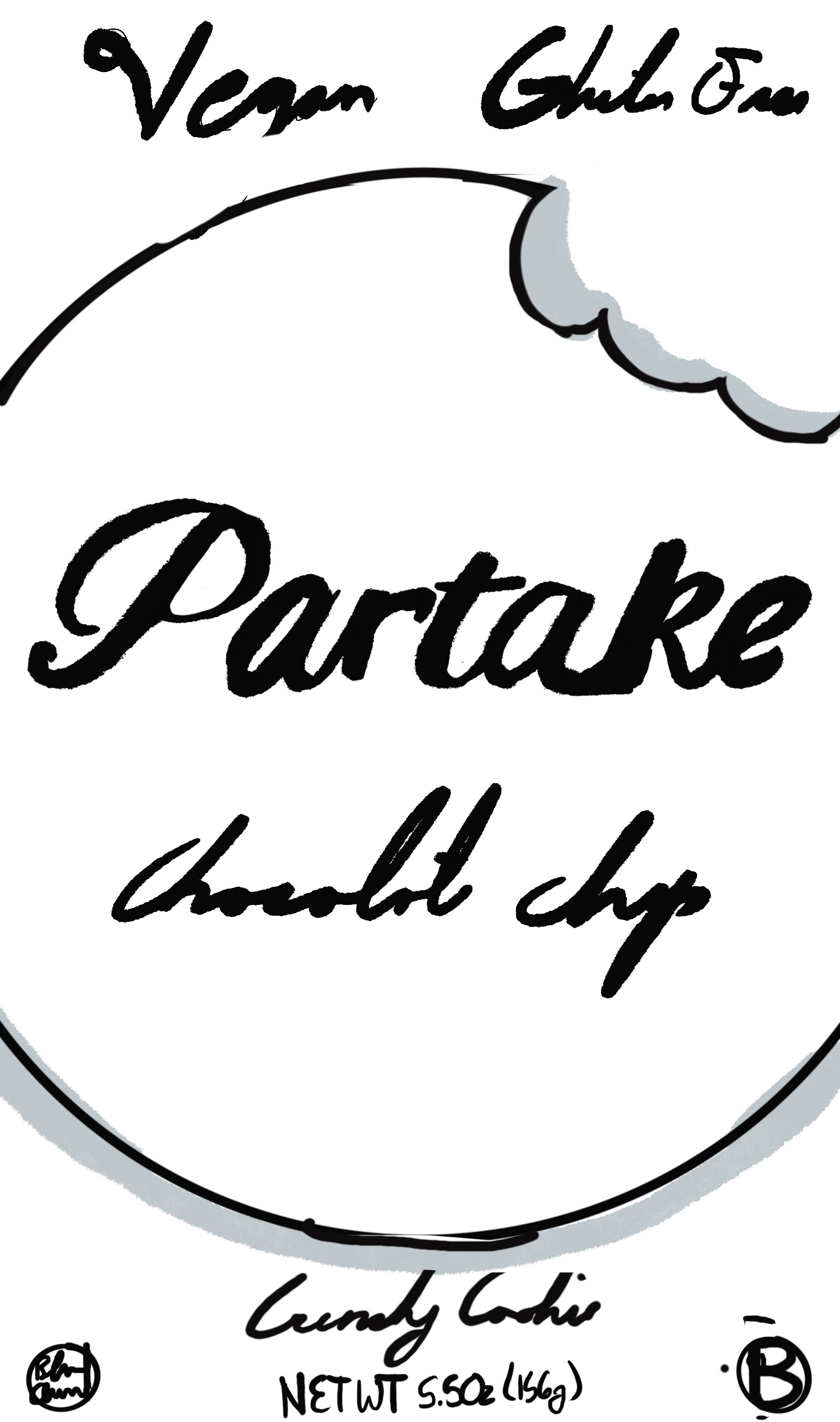
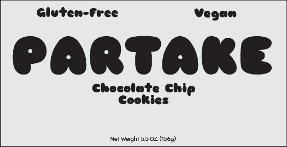
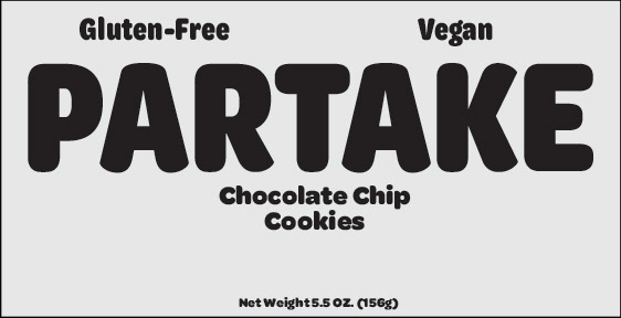
Final Design
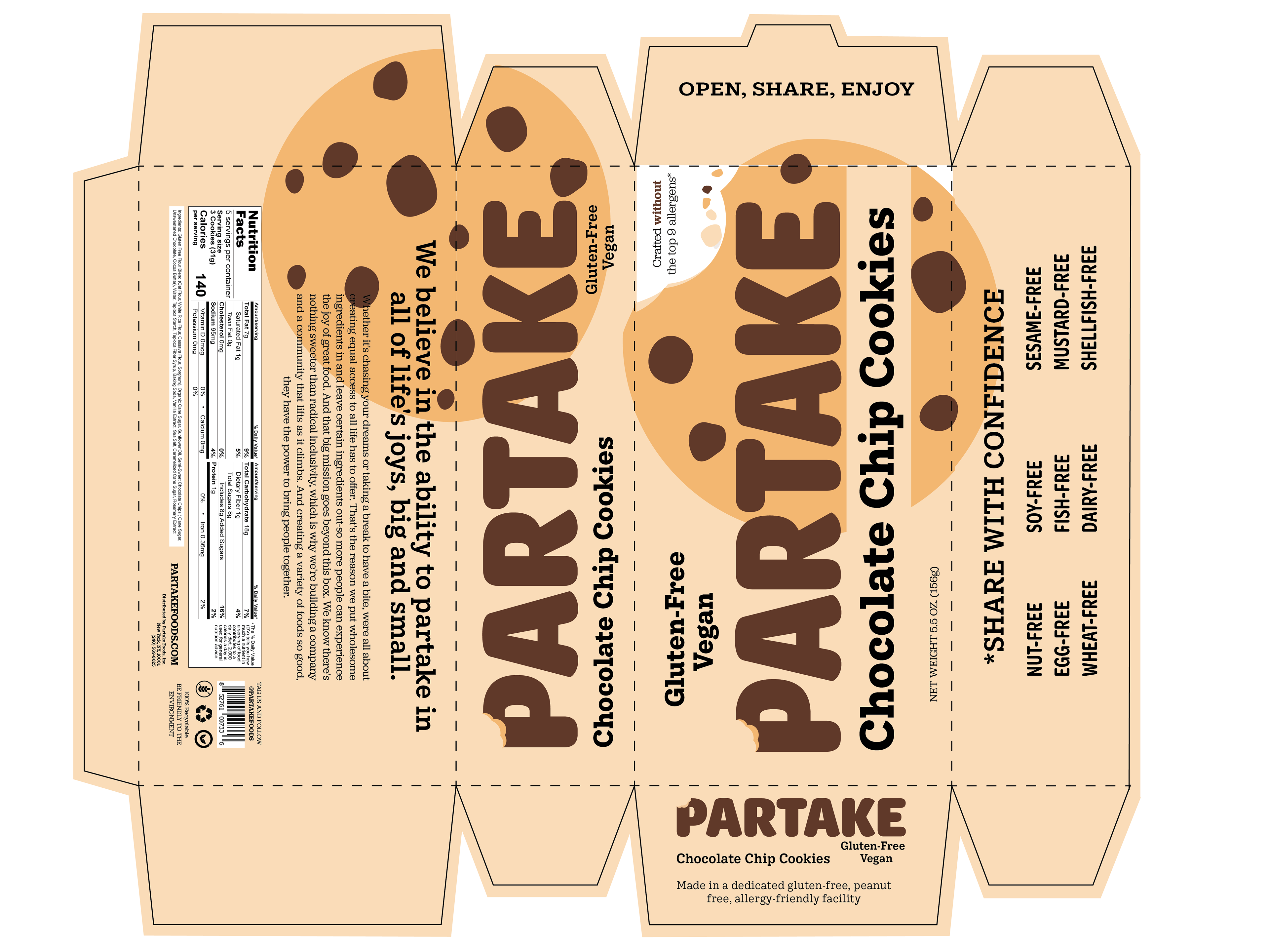
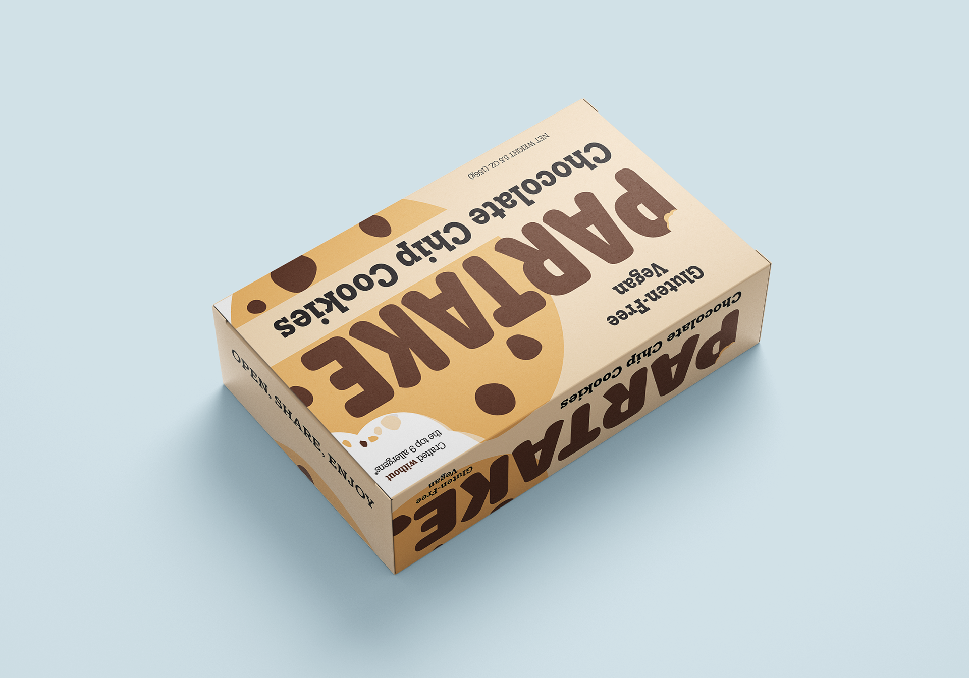
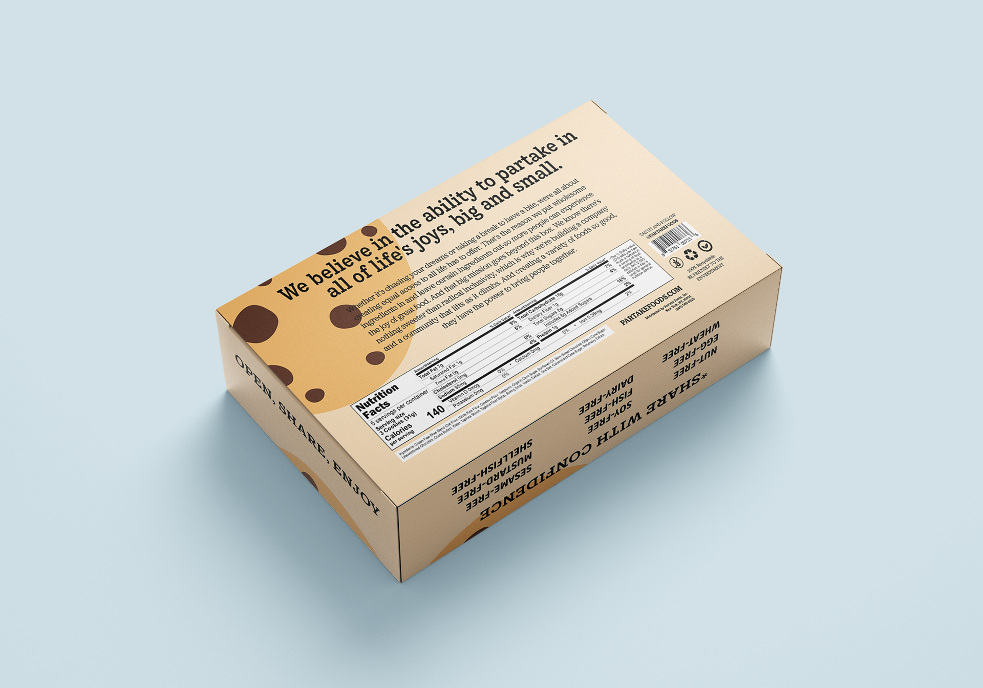
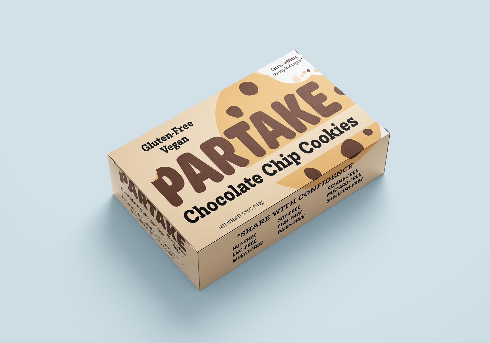
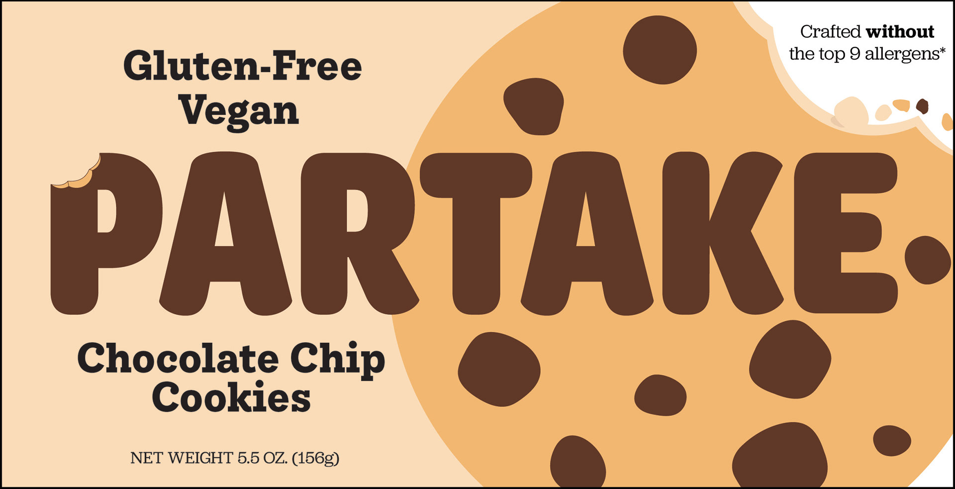
The updated design introduces a more fun and playful energy to the packaging, helping it stand out on the shelf while preserving its appeal. It also reinforces the company’s mission to create allergy-friendly, inclusive products, making those values more visually and emotionally present.